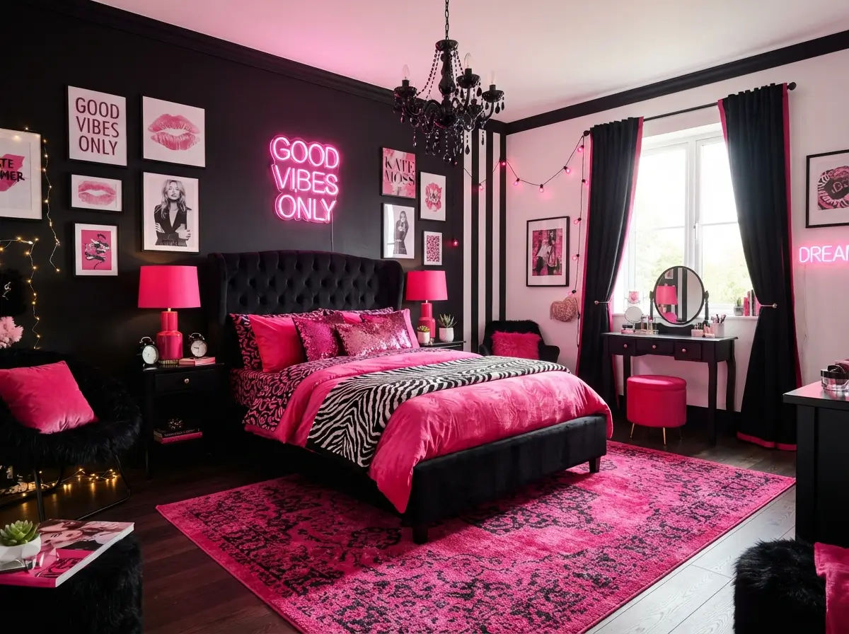

Strong contrast can make a bedroom feel exciting, but black and hot pink need careful balance. Too much black can make a small room feel closed in, while too much hot pink can make the space feel busy. The best Black and Hot Pink Bedroom combines dark grounding pieces, bright accents, calm neutrals, useful lighting, and enough open space for the eye to rest.
Good decorating choices matter more than expensive furniture. Paint placement, bedding layers, storage, curtain height, bulb temperature, and furniture scale can completely change how this color pairing feels. Beginners can use these ideas in a rental, a small room, a teen bedroom, or an adult space without turning the room into a themed set.
Can black and hot pink work in a bedroom?
Yes, a Black and Hot Pink Bedroom can look polished when one color leads and the other supports it. Use black for structure through furniture, frames, lighting, or one feature wall. Bring hot pink into the room through bedding, cushions, artwork, or one statement chair. Add white, warm grey, cream, or pale wood to soften the contrast and keep the room comfortable.
Balance becomes easier when you follow a simple ratio. Let one neutral cover about half of the room, use black for roughly one-third, and reserve hot pink for the final accent layer. The exact numbers can change, but the idea prevents both strong colors from competing equally across every surface.
Before shopping, take four quick photographs from each corner and note where daylight enters, where doors open, and which furniture must remain. Photos reveal crowded areas that are easy to overlook while standing in the room. Measure the bed wall, window width, wardrobe depth, and clear walking routes. Create a small color kit with paint cards, fabric pieces, and a flooring photo. Comparing every purchase against that kit reduces costly mismatches and keeps the final room connected.
Start with a soft neutral base

Warm white, soft grey, pale beige, and light greige give strong colors enough room to stand out. Neutral walls reflect light, which helps a small bedroom feel wider and less heavy. Black furniture then looks deliberate instead of overpowering, while hot pink accents gain energy without covering every part of the room.
Renters and beginners benefit most from this approach because it requires fewer permanent changes. Keep walls neutral, then add color through removable pieces such as a duvet cover, curtain panels, framed prints, a rug, and cushion covers. Choose warm white paint rather than icy white if the room receives little sunlight. Shades similar to ivory, oatmeal, or soft stone usually work better with rich pink than blue-based whites.
Testing undertones prevents a common decorating surprise. Place white and grey samples beside the existing floor because beige carpet, cool laminate, and reddish wood affect how wall colors appear. Review the samples with curtains open and again after switching on the lamps. Warm neutrals usually flatter magenta and raspberry, while cooler grey can suit pinks with a blue undertone. Keep skirting boards and doors similar to the main wall color when you want a smoother, less broken-up room.
Use one black feature wall behind the bed

Placing black behind the headboard creates a clear focal point and gives the bed visual importance. The dark wall also frames hot pink bedding, making the color look sharper and more controlled. Keeping the other walls light prevents the room from feeling boxed in, especially when the floor and ceiling remain pale.
Small rooms need thoughtful placement. Choose the wall with the fewest doors and windows, then keep large wardrobes or bookcases away from the same surface. Matte paint hides minor wall flaws better than gloss and causes less glare under lamps. Rental-friendly peel-and-stick wallpaper can create a similar effect, but test a sample first because some adhesives damage weak paint. Soft black, charcoal, or deep graphite may feel easier to live with than pure jet black.
Build the bed with layered pink tones
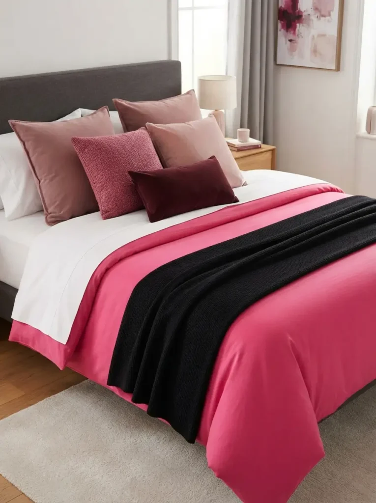
Using only one hot pink shade can make bedding look flat. Layering several related tones adds depth while keeping the palette connected. Start with white, light grey, or black sheets, add a hot pink duvet, then mix raspberry, blush, burgundy, and muted rose cushions. Varying the shades helps the bed feel styled rather than matched like a showroom set.
Busy households should choose washable cotton, microfiber, or cotton-blend covers instead of delicate velvet on every layer. Keep decorative pillows limited to three or five so making the bed stays manageable. One long lumbar cushion can replace several small cushions in a compact room. Pair bright pink with a black throw folded across the lower third of the bed, leaving enough of the duvet visible to maintain color balance.
Comfort should guide the order of every bedding layer. Keep breathable sheets closest to the body, place the most washable cover on top, and reserve textured throws for cooler nights or decoration. People with pets may prefer tightly woven fabrics that release hair more easily than deep velvet. Match pillow sizes to the bed width, since oversized cushions can crowd a single bed. Repeating one pink tone in the curtains or artwork will connect the bed without requiring a fully matched set.
Choose a black bed frame with open space underneath
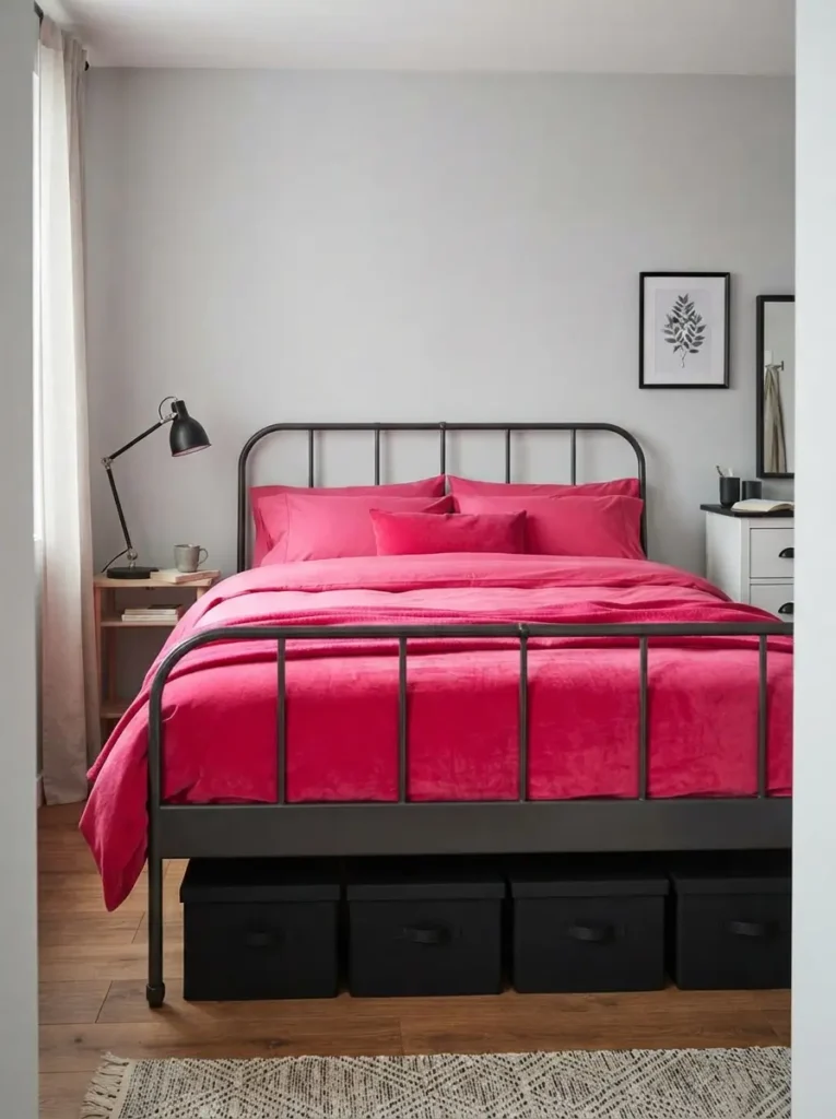
Slim black metal or raised wooden frames provide strong structure without creating a heavy block in the room. Visible floor beneath the bed makes a small bedroom feel more open, while the dark outline links easily with black lamps, frames, or handles. Hot pink bedding then becomes the main visual feature instead of competing with a bulky upholstered base.
People who need extra storage can still use this idea. Select a frame high enough for matching under-bed boxes, then keep the containers black, grey, or clear so they disappear visually. Avoid oversized sleigh beds in narrow rooms because curved ends use valuable walking space. Leave at least 60 centimetres beside the bed where possible, and keep the frame a few centimetres away from the wall to reduce scuffs and trapped dust.
Create a controlled hot pink accent wall
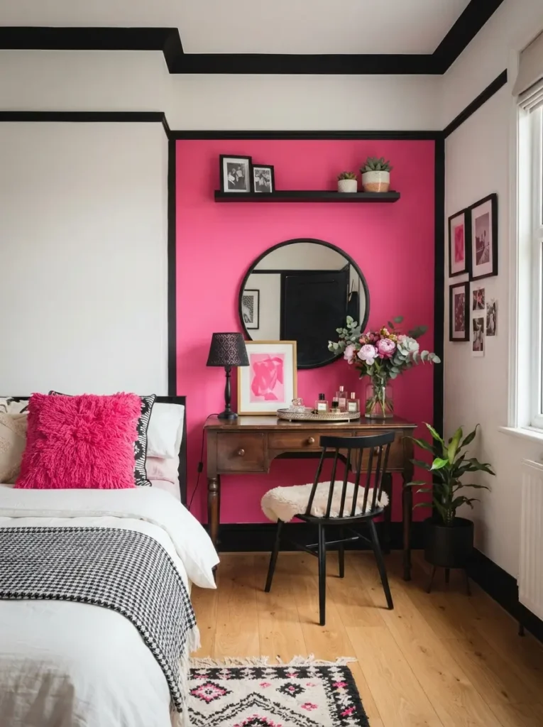
Bright pink walls can work, but placement makes the difference. Use hot pink on a smaller wall, inside an alcove, behind a dressing table, or across the lower half of the room. A smaller color field creates impact without flooding the space. Black trim, picture frames, or a narrow shelf can give the pink area a clean edge.
Creative renters can use removable wallpaper panels, peel-and-stick arches, or large painted boards leaned against the wall. The Black and Hot Pink Bedroom feels more intentional when the pink shade relates to fabrics already in the room. Carry the wall color into two or three smaller pieces, such as a cushion, vase, and print. Avoid repeating the same bright pink on every object because the room needs variation and breathing space.
Add black-and-white pattern for visual relief
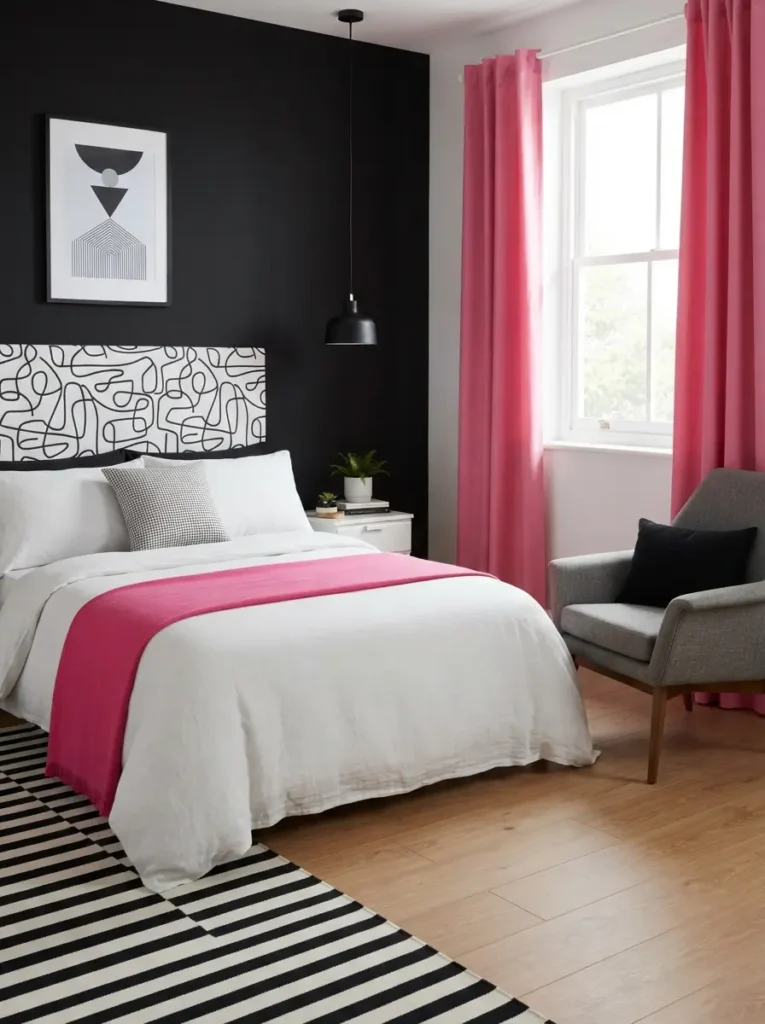
Stripes, checks, abstract lines, and small geometric prints can separate solid areas of black and pink. Pattern adds movement without introducing another dominant color. Black-and-white bedding, a rug, or curtain trim also creates a visual pause between bright accents, which helps the room feel layered and easier to look at.
Pattern size should match the room. Small bedrooms often suit medium stripes or simple grids because oversized motifs can make walls and textiles feel crowded. Use one main pattern and one smaller supporting pattern rather than mixing many designs. For example, pair a striped rug with plain hot pink curtains and one small checked cushion. People who prefer calmer rooms can choose thin pinstripes or subtle line art instead of bold zebra or checkerboard designs.
Pick warm lighting instead of harsh white bulbs

Lighting changes both colors more than many beginners expect. Cool white bulbs can make hot pink appear neon and black surfaces look flat. Warm bulbs around 2700K create a softer evening mood and add warmth to white, beige, and wood finishes. Neutral white bulbs around 3000K may suit a dressing table where clearer task lighting matters.
Layered lighting works better than one bright ceiling fixture. Combine a central light with bedside lamps, a desk lamp, and a low LED strip behind the headboard or under a shelf. Choose dimmable bulbs where possible so the room can shift from practical morning light to softer night lighting. Avoid exposed multicolor LED strips running around the ceiling unless the design is intentionally playful, because visible strips often make the room look unfinished.
Lamp placement deserves equal attention. Bedside shades should sit near shoulder level when you are seated, allowing light to reach a book without shining directly into your eyes. Frosted bulbs and fabric shades soften reflections from mirrors and glossy black furniture. Put task lighting near wardrobes or dressing tables rather than increasing the brightness of the whole room. Smart plugs can help renters control hard-to-reach lamps without changing any wiring, and timers can create a calmer evening routine.
Bring in pale wood to soften the contrast
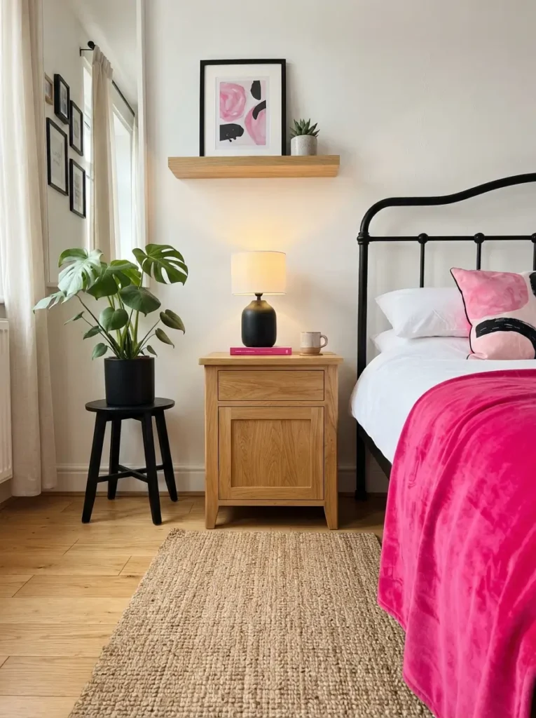
Natural wood introduces warmth and keeps the palette from feeling too sharp. Light oak, ash, birch, and pale pine work especially well with black furniture and hot pink fabrics. A wooden bedside table, bench, stool, or floating shelf can break up strong color while adding useful texture.
Budget decorators can sand and seal an inexpensive second-hand table rather than buying new furniture. Keep the wood finish consistent across two or three pieces so the room feels connected. Orange-toned woods may clash with blue-based pink, so compare samples in the room before committing. Best results often come from pale neutral wood or medium walnut used sparingly. Small-space decorators should favour floating shelves and narrow-legged tables because they preserve visible floor area.
Use hot pink curtains as a vertical accent
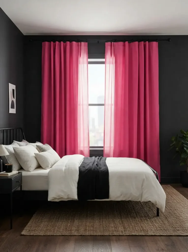
Curtains create a large block of color without taking up floor space. Hanging them close to the ceiling and extending the rod beyond the window makes the room look taller and the window look wider. Hot pink curtains can become the main accent when walls, bedding, and furniture stay mostly neutral or black.
Bedrooms facing a bright road need practical fabric choices. Use lined or blackout curtains for sleep, then select a matte finish rather than shiny satin, which can look overly reflective in strong daylight. Narrow rooms benefit from panels that just touch the floor instead of pooling heavily. When full pink curtains feel too bold, choose white curtains with a hot pink edge, black border, or pink inner lining that appears only when the panels open.
Make the headboard the statement piece
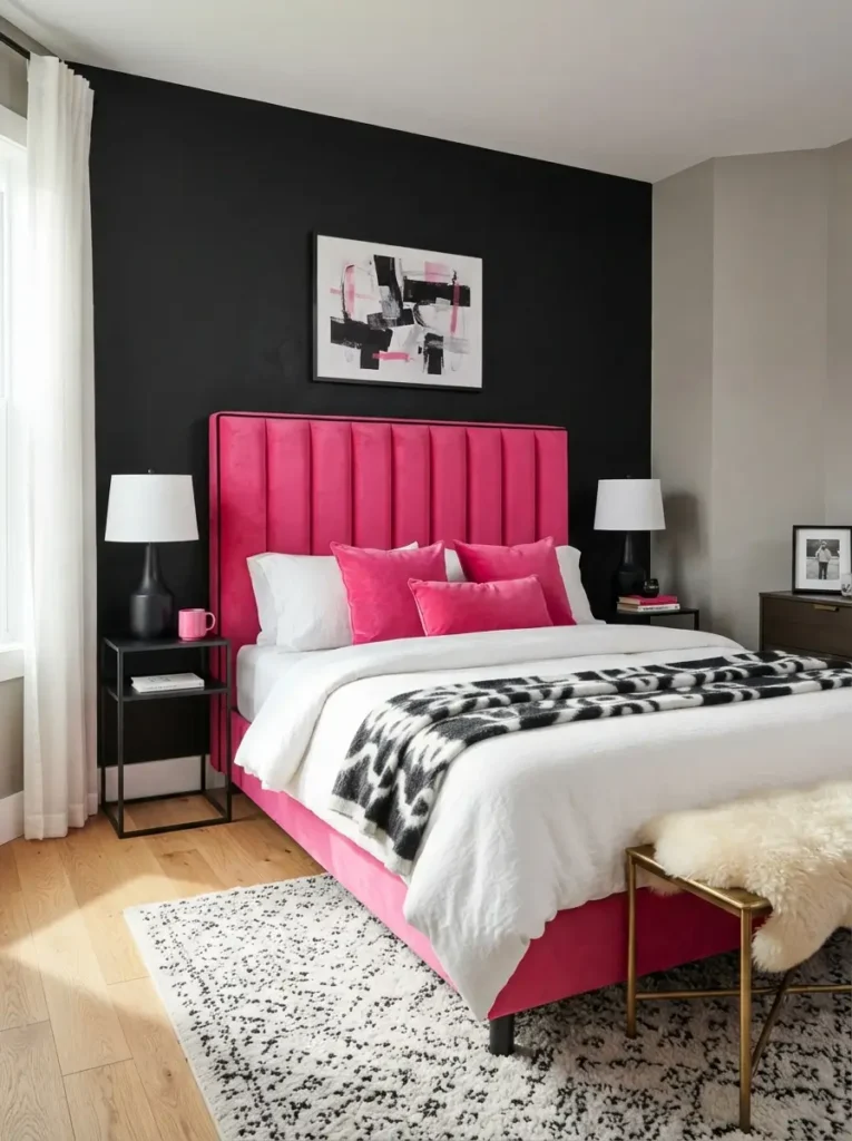
Upholstered headboards add softness to a palette built around hard black surfaces. Hot pink velvet, boucle, linen, or textured cotton can turn the bed into a clear focal point. Channel-tufted shapes feel modern, while a simple rectangular headboard suits smaller rooms and is easier to keep visually calm.
DIY options can lower the cost. Cover a plywood panel with foam, batting, and durable fabric, then mount it securely or place it behind the bed. Renters may prefer a freestanding headboard that does not need wall drilling. Keep the width close to the mattress size in a compact room, because an extra-wide design can make nearby tables feel squeezed. Black piping or a slim black frame can connect the pink fabric to the rest of the room.
Style a compact black dressing area

Black dressing tables create useful contrast and hide everyday marks better than white surfaces. A narrow console with one or two drawers can fit along a wall without using the depth of a full desk. Add a round mirror, a small tray, and one hot pink stool or chair to create a clear zone for getting ready.
Clutter control keeps the area attractive. Store cosmetics in shallow drawer inserts, place frequently used items on one tray, and keep cords clipped behind the table. Lighting should fall toward the face rather than from directly overhead, so use two side lights or a mirror with even built-in lighting. Bedrooms with limited space can use a wall-mounted shelf as a dressing table and tuck a stool underneath when it is not needed.
Add a rug that connects the whole palette

Rugs help strong colors feel related instead of scattered. Choose a design containing black, hot pink, and at least one quiet neutral. Abstract patterns, faded florals, simple grids, or irregular color blocks can work. The neutral part of the rug should usually cover the largest area so the floor does not become another competing feature.
Correct sizing matters more than pattern. A rug under a double or queen bed should extend beyond the sides where feet land in the morning. Smaller budgets can use runners on both sides of the bed or one large rug across the lower third. Low-pile rugs suit rooms with rolling storage boxes and are easier to clean. Avoid tiny rugs floating far from furniture because they can make the layout feel disconnected.
Floor type should influence the material. Flatweave rugs stay stable under doors and suit warm climates, while thicker wool or synthetic piles add comfort over hard flooring. Use a non-slip pad to stop corners from moving and to protect rental floors. Position the rug before placing heavy furniture, then check that doors, drawers, and under-bed storage still open freely. Cleaning becomes simpler when the rug can be reached by a vacuum without moving several pieces each week.
Use black frames to organize pink artwork

Gallery walls work well with this palette because black frames create order around colorful prints. Choose artwork with different amounts of hot pink, white, grey, and black rather than repeating identical graphics. A mix of typography, photography, abstract shapes, and simple line drawings gives the wall personality without relying on one theme.
Beginners should plan the arrangement on the floor before hanging anything. Keep gaps between frames consistent, usually around five to eight centimetres. In a rental, use removable hooks rated for the frame weight and avoid hanging glass pieces above the bed. One oversized print may suit a small room better than many little frames, especially when bedside lamps, shelves, and cushions already add visual detail.
Add one sculptural chair or bench

One accent seat can make the room feel complete and provide a place for reading, dressing, or laying out clothes. Choose a hot pink chair with a simple silhouette, or use a black bench with one bright cushion. Curved shapes soften straight wardrobes and bed frames, while slim legs keep the piece from looking bulky.
Space planning must come first. Leave a clear route from the door to the bed and wardrobe before adding extra furniture. A compact slipper chair fits well in a corner because it has no arms, while a storage ottoman can hold spare bedding. People with very small bedrooms should skip the chair and use a narrow bench at the foot of the bed only when at least 75 centimetres of walking room remains.
Introduce metallic details in small amounts

Chrome, brushed brass, and matte silver can lift the palette by reflecting light. Metallic drawer handles, lamp bases, mirror frames, curtain rods, or small trays create polish without adding another strong color. Silver suits cooler black-and-pink schemes, while brass brings warmth to rooms with beige, cream, or wood.
Moderation prevents the bedroom from looking overly glamorous. Repeat one metal finish in three or four places rather than mixing chrome, gold, copper, and rose gold across every object. Affordable upgrades include replacing handles on a basic chest, spraying an old lamp base, or adding a slim metal picture frame. People who prefer a modern style may choose blackened steel or brushed nickel, while softer rooms can use muted antique brass.
Use storage as part of the color plan
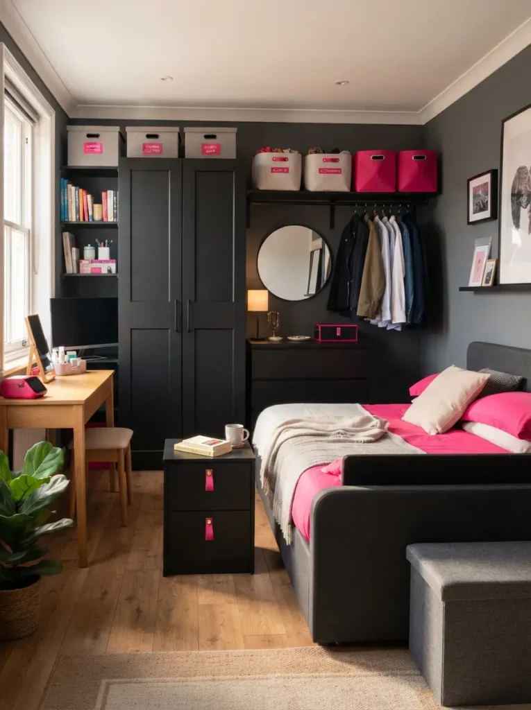
Storage affects the final look because visible boxes, baskets, and rails occupy real visual space. Black wardrobes and drawer units create a strong base, while hot pink labels, fabric bins, or handles can add controlled color. Closed storage works best for small items, since open shelves quickly become busy when every product has different packaging.
Small bedrooms need furniture that serves more than one role. Pick a bedside table with drawers, a storage bed, a bench with a lift-up lid, or a desk that doubles as a dressing table. Keep frequently used items between waist and eye level, and move seasonal items higher or under the bed. Matching containers create calm, but avoid buying too many before measuring shelves and deciding what truly needs storage.
Finish with texture instead of more color

Texture makes a two-color scheme feel rich without adding visual noise. Combine matte painted walls, soft cotton bedding, a knitted throw, smooth metal, natural wood, and one plush fabric. The room gains depth because light reacts differently to each surface, even when the palette stays limited.
People who dislike clutter will appreciate this method because texture adds interest without filling shelves. Use ribbed cushions, a waffle blanket, linen curtains, or a low-pile rug rather than adding more ornaments. Keep shiny surfaces limited, especially when the room already has mirrors or glossy wardrobes. Finishing touches should support comfort, so choose fabrics that feel pleasant, wash well, and suit the local climate rather than selecting materials only for appearance.
Common mistakes to avoid
Overusing both strong colors is the most common problem. When black covers the walls, bed, floor, curtains, and furniture, the room can lose definition. When hot pink appears on every textile and accessory, the eye has nowhere to rest. A Black and Hot Pink Bedroom needs quiet areas, so keep the ceiling, some wall space, and at least one large textile in a light neutral.
Ignoring natural light can also lead to disappointing results. North-facing or shaded rooms may make pure black feel heavier, while intense afternoon sunlight can make bright pink look harsher. Test paint and fabric samples at several times of day before buying large quantities. Warm charcoal may suit a dark room better than black, and raspberry may look calmer than fluorescent pink under direct sun.
Choosing furniture that is too large creates another issue. Oversized beds, wide bedside tables, deep dressers, and bulky chairs can make a color-rich room feel crowded. Measure the walls, door swing, wardrobe access, and walking paths before shopping. Tape furniture outlines on the floor to understand the real footprint. Leave visual space around statement pieces so each one can be appreciated.
Matching every item too closely often makes the room feel flat. Identical pink on walls, bedding, curtains, rug, and artwork removes depth. Use related shades instead, and mix materials so each surface reflects light differently. Black should vary slightly too, with combinations of matte, charcoal, soft black, and natural shadows creating a more comfortable result.
Poor lighting can undo good decorating. One bright cool-white ceiling bulb may exaggerate contrast and create hard shadows. Use layered warm lighting, especially near the bed and dressing area. Hide cables, choose lamps at useful heights, and make sure light switches are easy to reach. Decorative lighting should still support reading, dressing, and cleaning.
Budget-friendly ways to style the room
Paint delivers the biggest change for the lowest cost, but full-room painting is not always necessary. One feature wall, a painted arch, a half-wall, or a narrow color block behind the bed can create focus with less paint. Sample pots may be enough for small shapes, shelves, frames, or drawer fronts. Renters can paint removable boards and lean them behind furniture.
Second-hand furniture offers strong value when the shape and size are right. A basic chest can become modern with black paint and new handles. An old chair can gain new life with a hot pink cushion or slipcover. Inspect drawers, joints, smells, and wood damage before buying. Spending less works best when the piece is structurally sound and only needs surface improvement.
Textiles provide an easy seasonal update. Cushion covers, throws, curtains, and duvet covers cost less than replacing furniture, and they can be stored or changed later. Choose standard sizes so replacements remain affordable. One quality hot pink duvet cover usually creates more impact than many small decorations purchased without a plan.
Printable artwork, framed fabric, postcards, and magazine pages can fill walls at low cost. Use matching black frames from discount shops or repaint mixed second-hand frames for a consistent finish. Large art can be made by stretching fabric over a lightweight frame. Keep the composition simple, especially above a busy bed.
Lighting upgrades do not need to be expensive. Replace cool bulbs with warm LED bulbs, add plug-in wall lights, or use a small table lamp on a shelf. Battery-operated picture lights can highlight artwork where wiring is difficult. Check brightness, color temperature, and battery life before buying decorative lights that may not provide enough useful illumination.
Planning purchases by impact helps a limited budget go further. Spend first on the pieces that cover the largest visible areas, usually paint, bedding, curtains, and a rug. Delay small accessories until those items are in place. Set a fixed amount for each category and keep receipts until the palette is settled. Returning one unsuitable purchase is better than forcing it into the room and then buying several extra objects to make it fit.
Black and Hot Pink Bedroom styling tips
Choose the leading color before shopping. Rooms that feel balanced usually treat black as the structural color and hot pink as the accent, or reverse that relationship in a lighter space. Writing down the chosen ratio helps prevent impulse purchases. A simple plan might use neutral walls, a black bed and dresser, pink bedding, and small amounts of wood and metal.
Repeat each strong color at different heights. Place black near the floor through furniture or a rug, at eye level through frames or lamps, and higher through a curtain rod or shelf. Repeat hot pink on the bed, one wall piece, and one smaller accessory. Distribution helps the room feel connected without making every corner identical.
Scale should guide every decision. Large rooms can handle a full black wall, broad curtains, and a generous upholstered headboard. Compact rooms often look better with slimmer furniture, lighter walls, raised legs, and fewer decorative layers. One bold item usually has more effect than five small objects competing for attention.
Practical needs should shape the style. Bedrooms need comfortable sleep, clear walking paths, storage, easy cleaning, and suitable lighting. Place the boldest colors where they will not interfere with rest. Someone sensitive to bright color may prefer hot pink behind the headboard rather than directly facing the bed.
Sample everything in the actual room. Paint, fabric, wood, and metal can shift under daylight and artificial light. Place samples beside the floor, furniture, and bedding, then review them in the morning and evening. A color that looks balanced in a shop may appear much brighter at home.
Editing the room after installation is part of the process. Remove accessories from one surface, photograph the result, and add back only the pieces that improve function or balance. Empty space around a lamp, frame, or vase makes that item easier to notice. Store unused decor rather than displaying everything at once. Rotating cushions, throws, and prints through the year can refresh the scheme without creating constant shopping pressure.
Frequently asked questions
What colors go well with black and hot pink?
Warm white, cream, soft grey, charcoal, pale wood, and muted beige work well because they reduce the intensity of the main colors. Silver gives a cooler modern finish, while brass or walnut adds warmth. Use one or two supporting colors instead of introducing many unrelated shades.
Is black suitable for a small bedroom?
Black can work in a small room when it appears on one wall, slim furniture, frames, or lower parts of the space. Keep the ceiling and most walls light, use several light sources, and choose furniture with visible legs. Large glossy black surfaces may feel heavier than matte charcoal or soft black.
How much hot pink should I use?
Start with smaller areas such as bedding, curtains, a chair, artwork, or cushions. Around ten to twenty percent of the visible room is often enough for a strong accent. Add more only after living with the first layer for a few days and checking the color in different light.
Can renters use this color scheme?
Renters can rely on removable wallpaper, peel-and-stick shapes, large framed art, textiles, rugs, lamps, and freestanding headboards. Painted furniture can add black without changing walls. Always test adhesive products on a hidden spot and follow the rental agreement before drilling or painting.
Which lighting temperature suits these colors?
Warm white bulbs around 2700K usually create the most comfortable bedroom light. Neutral white around 3000K can work near a mirror or desk. Cool bulbs above 4000K often make hot pink look sharper and can create a less relaxing atmosphere, so use them only for specific tasks.
How do I keep the room from looking too young?
Use clean furniture lines, restrained patterns, quality fabrics, and deeper pink shades such as raspberry or magenta. Keep novelty accessories limited and add adult materials like linen, wood, brushed metal, or structured upholstery. Strong color can feel mature when the layout remains calm and purposeful.
Conclusion
Bold color works best when it supports the room rather than controlling it. A successful Black and Hot Pink Bedroom uses black to create structure, hot pink to bring energy, and neutral tones to provide rest. Thoughtful lighting, correctly sized furniture, useful storage, and varied texture make the palette easier to live with every day.
Start with one main change, such as bedding, a feature wall, or a headboard, then build slowly. Measure before buying, test colors in the actual light, and keep walking space clear. Careful choices will create a bedroom that feels confident, practical, personal, and comfortable without requiring a large budget or a complete renovation.
Simple maintenance keeps the scheme looking intentional. Wash bright textiles according to label directions, dust dark furniture regularly, and repair loose handles early. Keeping surfaces clear also preserves contrast, because black and hot pink lose impact when everyday clutter covers their lines.
Final decisions should reflect the person using the room. Someone who reads at night needs better bedside lighting, while a student may need a compact desk and cable storage. Shared bedrooms need clear storage zones and equal access to plugs and wardrobes. Let function decide which decorative idea deserves space, then use color to support that choice. Rooms feel more successful when daily routines remain easy after the makeover is finished.