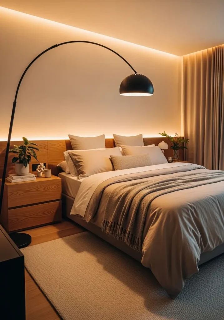
Color quietly shapes how a bedroom feels long before furniture or decor makes an impression. Soft tones can calm the mind after busy days, while richer shades add personality and warmth, making a room feel deeply personal. Choosing the right color pairing often turns an ordinary bedroom into a comforting retreat that feels thoughtfully styled.
Beautiful bedrooms rarely depend on complicated design ideas. Balanced color combinations create harmony naturally, helping textures, lighting, and furniture work together with ease. When colors feel connected and gentle on the eyes, spaces begin to feel cozy, stylish, and welcoming every single day.
Why Bedroom Color Combos Matter More Than Decor
Color creates mood before anything else is noticed. Balanced combinations help rooms feel peaceful while still looking stylish. When shades complement each other softly, bedrooms gain depth and warmth without needing excessive decoration or dramatic styling choices.
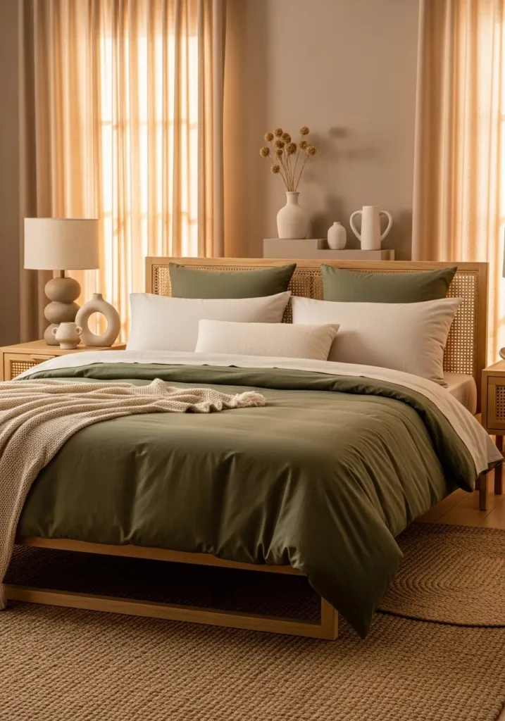
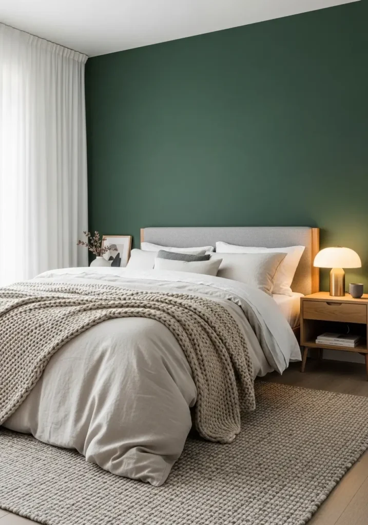
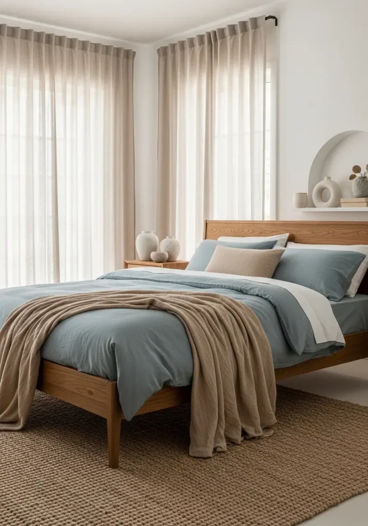
Sage Green and Warm Beige
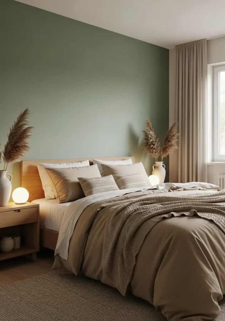
Sage green paired with warm beige creates calm energy that feels grounded and comforting. Green brings nature indoors while beige softens the overall look, allowing light to move gently across surfaces. This combination works beautifully with natural fabrics and wooden furniture, creating a peaceful environment perfect for rest and slow mornings. Soft layering keeps the room feeling warm rather than minimal, giving the space a quiet elegance that feels effortless and inviting in every season.
Cream and Soft Taupe

Cream and soft taupe create timeless elegance without feeling overly formal. Cream reflects light beautifully, helping bedrooms feel airy, while taupe introduces gentle depth that prevents the space from looking flat. Together, they build warmth that feels refined yet relaxed. Layered textiles and subtle textures allow the palette to feel cozy and welcoming, making this combination ideal for anyone who loves calm luxury with a soft, feminine touch.
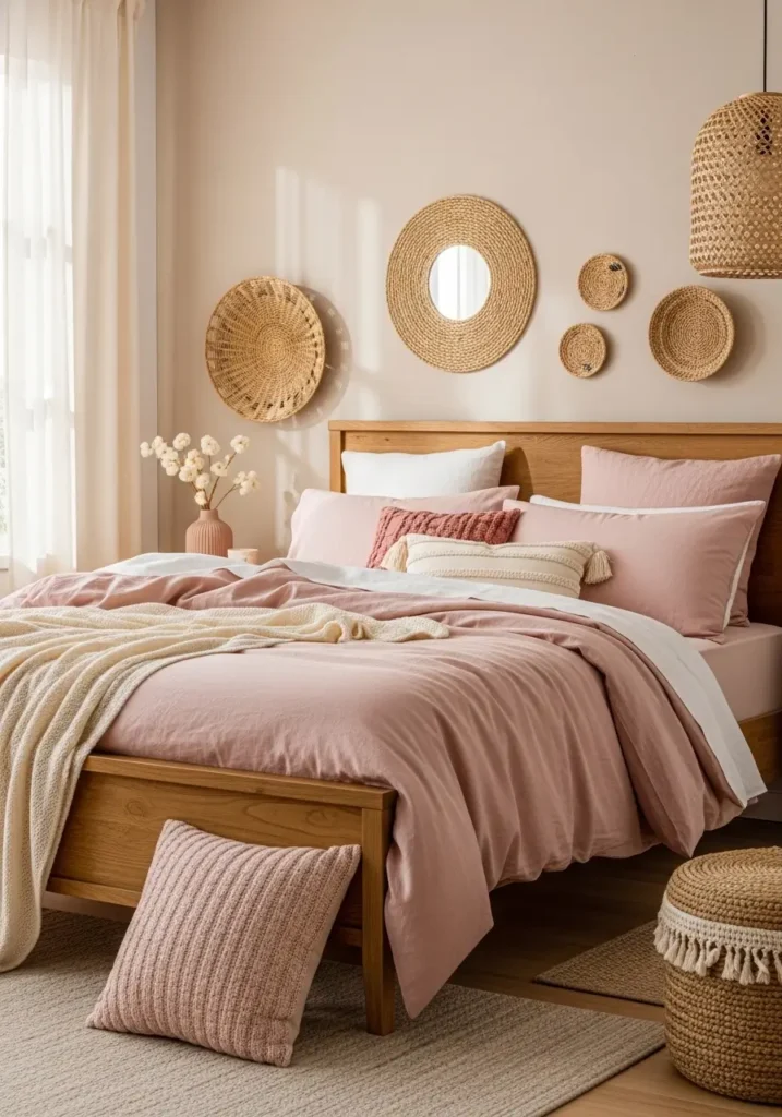
Dusty Rose and Warm White
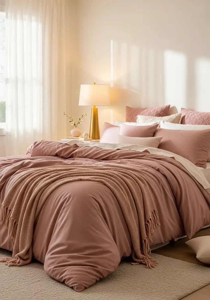
Dusty rose adds gentle romance while warm white keeps the room balanced and fresh. Muted pink tones feel soft rather than bold, creating warmth that feels comforting without overwhelming the space. This pairing works beautifully with gold accents and soft fabrics, giving bedrooms an inviting glow that feels calm, cozy, and quietly elegant throughout the day and evening.
Navy Blue and Cream
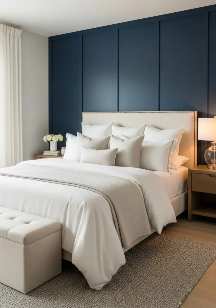
Navy blue introduces richness and depth while cream balances the space with softness. Deep blue walls or textiles create a cocoon-like feeling, perfect for restful sleep, while lighter tones prevent a sense of heaviness. This pairing feels classic and sophisticated, especially when combined with warm lighting and natural textures that soften contrast beautifully.
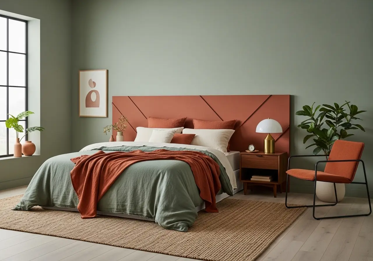
Terracotta and Sand
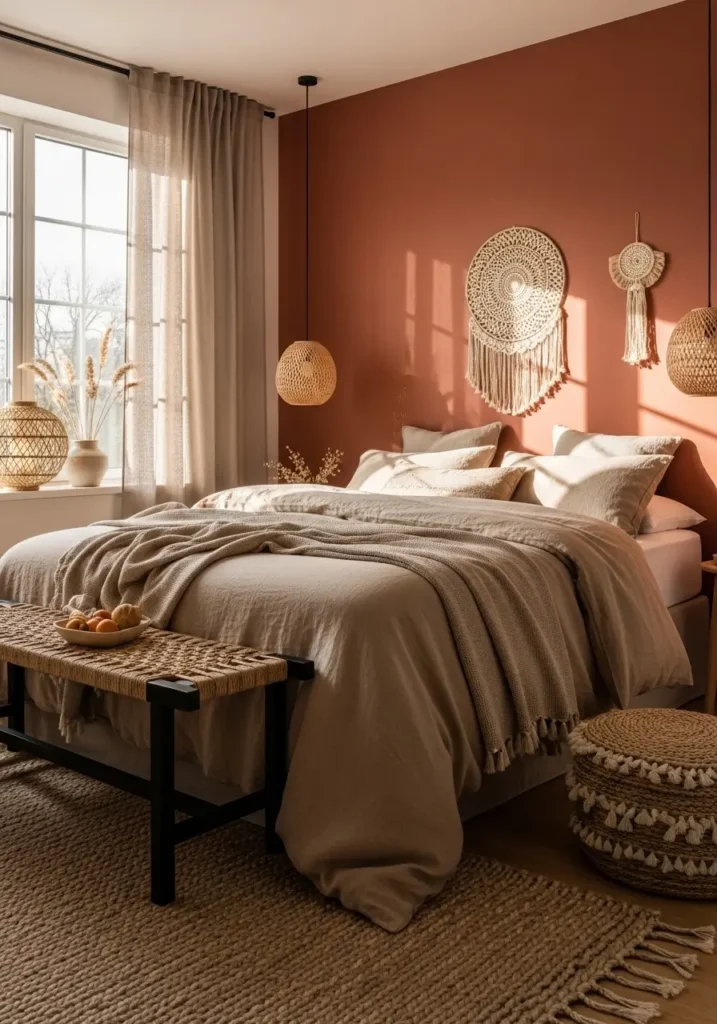
Terracotta paired with sandy neutrals brings earthy warmth that feels cozy and grounded. Clay-inspired tones add personality while sand shades keep the room light and breathable. This palette works beautifully with woven textures and natural materials, creating relaxed comfort that feels warm without becoming heavy or dark.
Olive Green and Soft Ivory
Olive green paired with soft ivory creates a gentle contrast that feels calm and grounded without appearing heavy. Green tones introduce nature-inspired comfort, while ivory keeps the room open and bright. Together, they create a balanced warmth that works beautifully with wood textures and woven fabrics, helping the bedroom feel peaceful, relaxed, and quietly elegant throughout the changing daylight.
Lavender Gray and Warm White
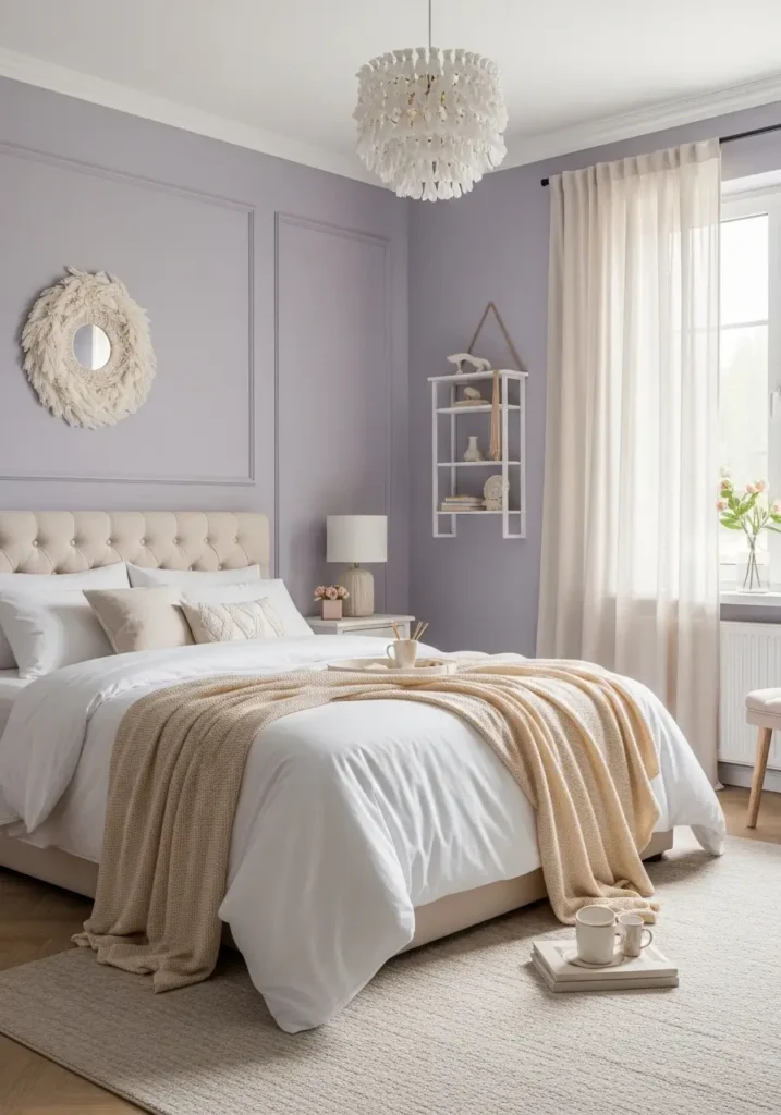
Lavender gray adds softness with a subtly dreamy feel, while warm white keeps the space fresh and balanced. This combination feels airy yet comforting, perfect for creating restful bedrooms that feel gentle rather than overly colorful. Soft textiles and diffused lighting help the palette glow quietly, making the room feel cozy and emotionally calming.
Charcoal Gray and Soft Linen
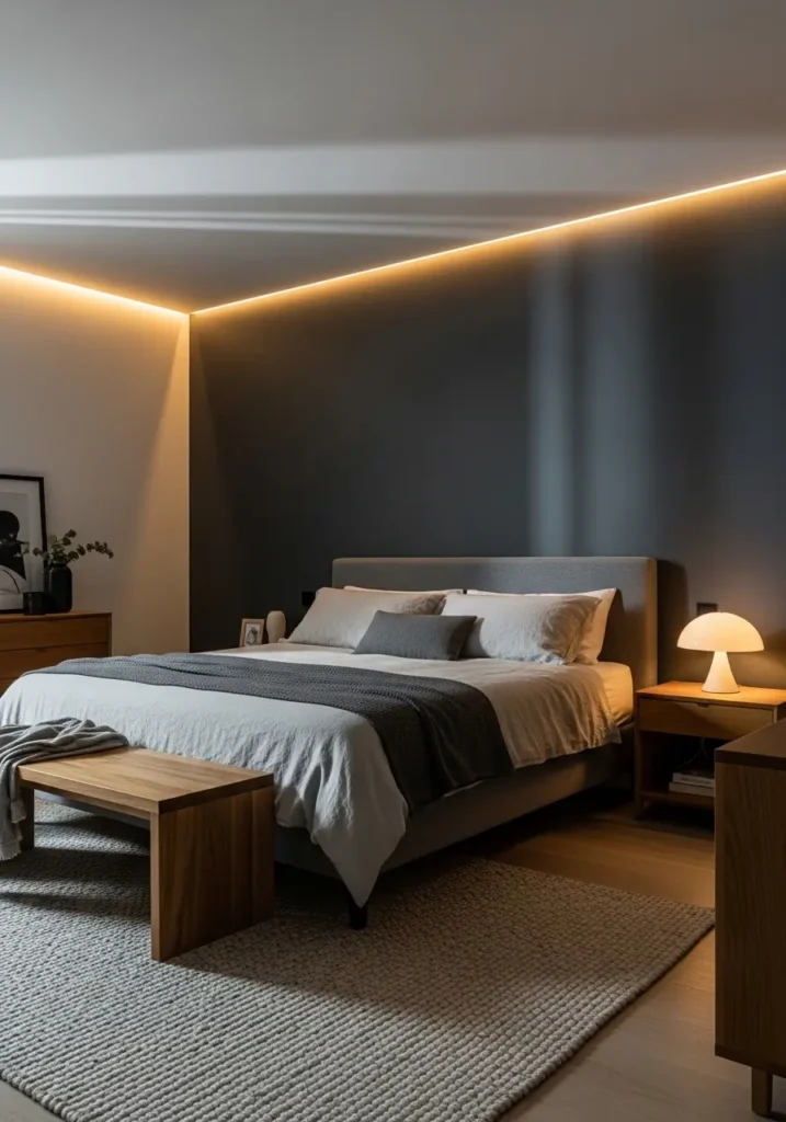
Charcoal gray adds depth and sophistication while soft linen tones prevent the room from feeling dark. Balanced contrast creates cozy drama that feels modern yet welcoming. Layered fabrics soften the strong color presence, allowing the bedroom to feel warm and restful rather than bold or overwhelming.
Blush Pink and Natural Wood
Blush pink combined with natural wood creates warmth that feels soft and inviting without looking overly sweet. Muted pink tones add a gentle personality while wood textures ground the palette naturally. This pairing creates relaxed elegance that feels cozy, balanced, and effortlessly stylish for everyday living.
Sky Blue and Warm Beige

Sky blue brings freshness and calm, while warm beige adds grounding comfort, keeping the room cozy. This pairing feels light and airy yet still warm enough for relaxation. Gentle contrast helps bedrooms feel open, peaceful, and welcoming throughout both morning light and evening calm.
Forest Green and Cream
Forest green paired with cream creates depth while still feeling calm and welcoming. Deep green tones add richness that feels cozy and grounding, while cream softens the look and reflects light gently around the room. This pairing works beautifully with layered textiles and warm lighting, helping bedrooms feel peaceful, balanced, and quietly luxurious without appearing heavy or dramatic.
Peach and Soft White
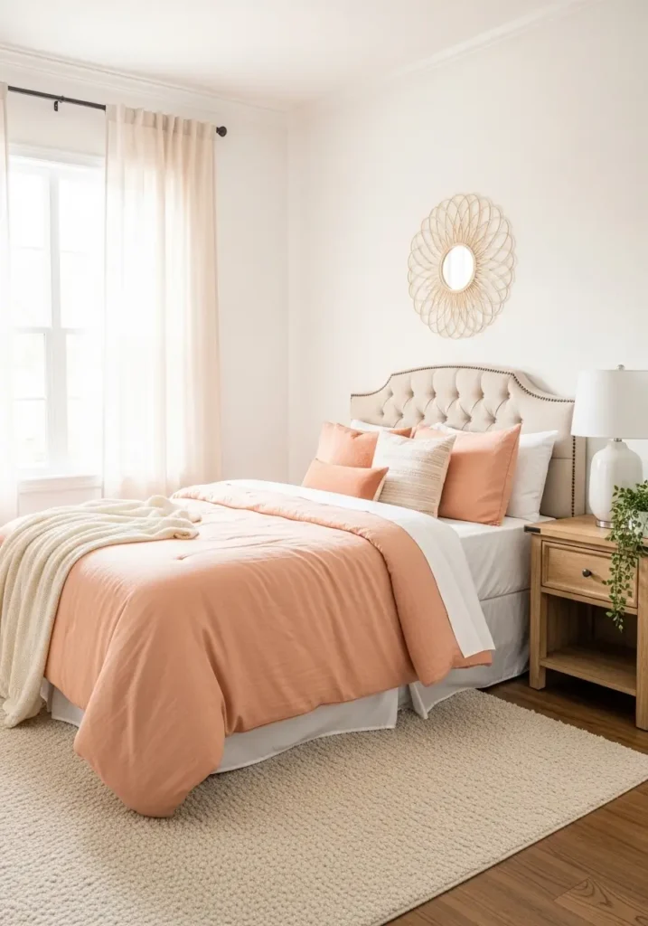
Peach tones introduce a gentle, uplifting warmth, while soft white keeps the room bright and airy. This combination adds subtle color without overwhelming the space, creating a relaxed environment perfect for slow mornings and calm evenings. Soft fabrics and natural textures allow the palette to feel cozy and inviting.
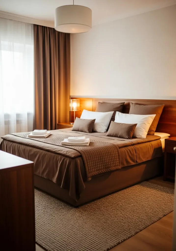
Chocolate Brown and Ivory
Chocolate brown introduces deep warmth that feels comforting and grounded, while ivory balances the palette with softness and light. Together, they create a cozy contrast that feels sophisticated yet welcoming. This pairing works especially well with layered bedding and warm lighting that gently highlights rich textures.
Dusty Blue and Warm Gray

Dusty blue adds calm freshness while warm gray provides grounding softness that keeps the room balanced. This palette feels modern yet soothing, making bedrooms appear polished without feeling cold. Gentle color harmony allows textures and lighting to stand out naturally, creating relaxed elegance.
Mustard Gold and Cream
Mustard gold adds warmth and personality, while cream tones soften the brightness for balance. This combination feels cheerful yet refined, bringing cozy energy into bedrooms without becoming overpowering. Warm lighting and textured fabrics help the palette feel inviting and stylish throughout the day.
Sage Blue and Soft Sand
Sage blue paired with soft sand tones creates calm coastal warmth without feeling overly themed. Blue introduces gentle freshness while sandy neutrals keep the bedroom grounded and cozy. This palette reflects natural landscapes, helping the room feel airy during the day and peaceful at night while maintaining relaxed elegance.
Warm Beige and Matte Black
Warm beige softens interiors while matte black adds contrast that feels modern and refined. Balanced carefully, dark accents frame the space without overpowering comfort. This pairing creates sophisticated simplicity, helping bedrooms feel polished while still warm and inviting for everyday relaxation.
Soft Mint and Cream
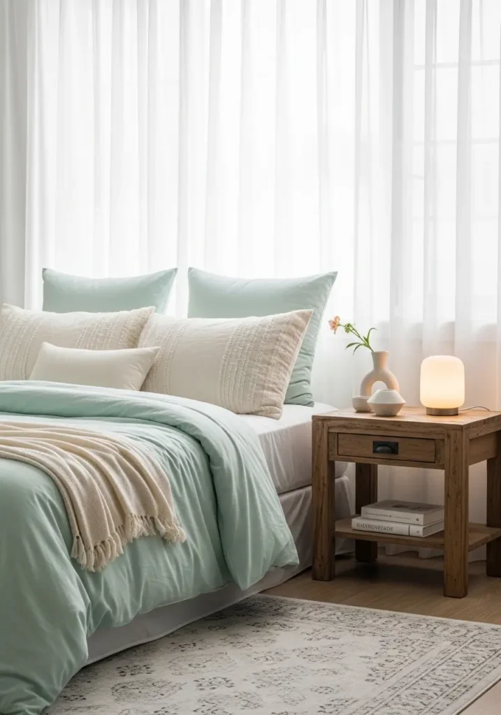
Soft mint introduces a calming freshness rather than a bright one, while cream tones add warmth and softness. Together, they create a gentle harmony, perfect for peaceful bedrooms. Light fabrics and natural textures allow the palette to feel airy and comforting, making the space feel restful and welcoming.
Mocha Brown and Warm White
Mocha brown creates cozy depth while warm white balances brightness beautifully. Rich tones add comfort without making the room feel dark, especially when paired with layered textiles and soft lighting. This combination feels timeless and nurturing, ideal for bedrooms designed for relaxation and warmth.
Pale Lavender and Soft Beige
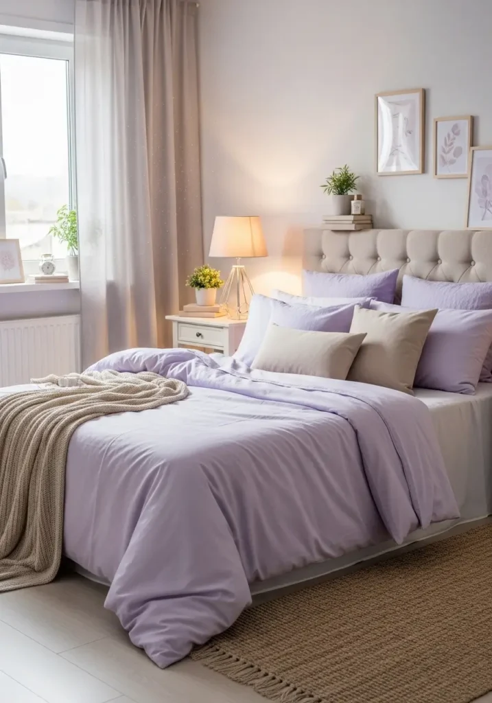
Pale lavender adds subtle softness while beige tones keep the space grounded and calm. Gentle color harmony creates dreamy warmth without feeling overly decorative. This palette works beautifully with layered fabrics and soft lighting, helping bedrooms feel peaceful, cozy, and quietly stylish.
FAQ
Which bedroom colors feel most relaxing?
Soft greens, warm neutrals, muted blues, and gentle earth tones often create calm environments that support rest and comfort.
Can trendy color combos still feel timeless?
Yes. Choosing muted versions of popular colors helps rooms stay stylish while remaining comfortable over time.
How many colors should a bedroom include?
Two main tones, with subtle supporting shades, usually create a balanced harmony without visual clutter.
Do darker colors make bedrooms feel smaller?
When paired with lighter tones and soft lighting, darker shades can actually make rooms feel cozy and inviting.
Final Thoughts
Beautiful bedrooms often begin with thoughtful color choices rather than complicated decor changes. Balanced palettes help spaces feel calm, welcoming, and naturally stylish. When colors work gently together, lighting feels softer, textures stand out more, and everyday moments become more comfortable. Small adjustments in tone and layering can completely shift how a room feels without overwhelming effort.